Data visualizations with Flourish
Geodata in online marketing provide information about how successful campaigns and reach were in different regions, where the potential is greatest and where wastage in the area of paid advertising can be minimized. To visualize this data, there are many tools on the market, one of them is the data visualization tool Flourish. Flourish is an easy-to-use tool that allows geographic data to be presented in interactive maps, charts, and infographics. It offers a variety of templates and options to present the data in an attractive and understandable way. It is also possible to display more detailed information, for example in the form of an info popup, by clicking on a specific area on the map.
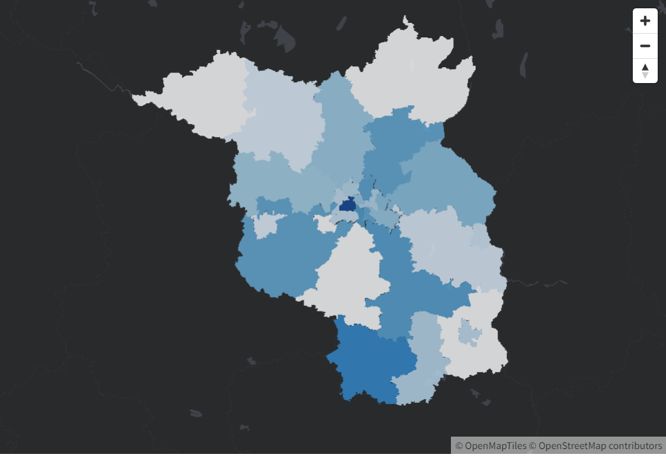
Simple, interactive 2D map visualization at Flourish, for clicking on counties and urban districts in Brandenburg, as well as districts in Berlin.
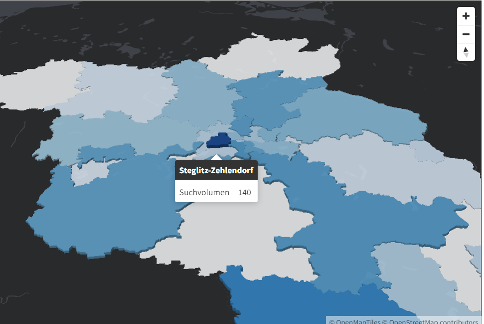
Flourish’s use of geomarkers and info popups to present online marketing data.
Maps in 2D and 3D with GeoJSON at Flourish
With Flourish you can use interactive maps in 2D and 3D: the data can be presented in different ways, such as markers that indicate specific locations or colors that represent the intensity of the campaign in a region. If a map doesn’t exist in Flourish’s map library, you can also simply download the map data in GeoJSON format from Github and open a 2D or 3D map on Flourish and upload the map data. GeoJSON is an open geographic data format that allows storing information such as geometry, attributes, and other relevant information for a map. If you have map data in GeoJSON format, you can easily and quickly upload that data to Flourish to visualize it.
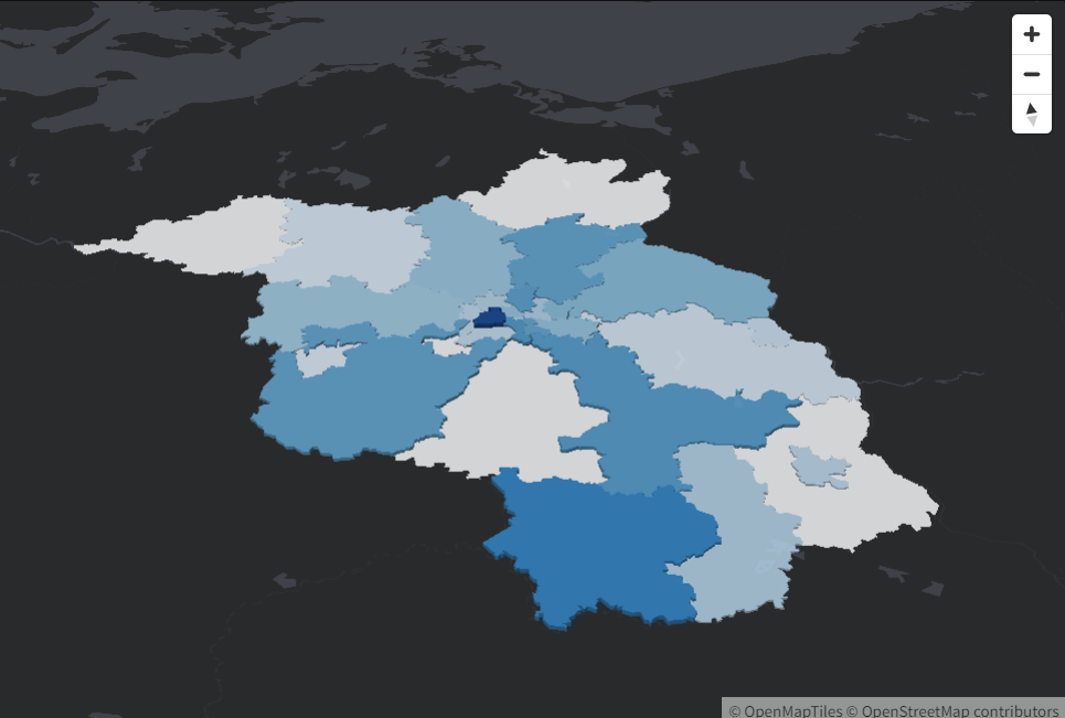
3D map visualization with polygons for individual counties, independent cities and districts.
Story feature of maps and charts at Flourish
Flourish also offers the possibility to display geographic data in so-called stories. The data can be played back over time in a clear and understandable way. Such stories are particularly useful for presenting complex data in an understandable way and summarizing the results of the campaign. This feature allows users to build a narrative by combining maps with data points, images and text to provide a deeper understanding of the data. Flourish’s Stories feature offers an intuitive interface that allows users to create and publish their stories quickly and easily. With this new feature, users can now tell data-driven stories.
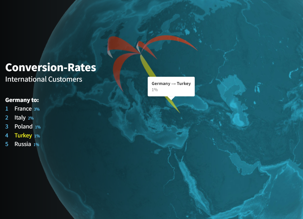
Flourish’s story feature lets you play your interactive map visualizations over time to visualize changing weights on specific data.

Marketing & Lead Gen
SEA, paid media, conversion rate optimization, market and trend analysis in the Berlin-Brandenburg area.
Phone: +49 176 588 744 04
Email: info@slavawagner.de