Instructions for creating a forecast with Microsoft Power BI
1. Download Microsoft Power BI for Desktop
The download is free and is located directly on the Microsoft product page.
2. Import data for forecasts in Microsoft Power BI
Prerequisite: An Excel or CSV table is required. Click on “File” in the top left menu, click on “Retrieve Data” and then select the Excel spreadsheet.
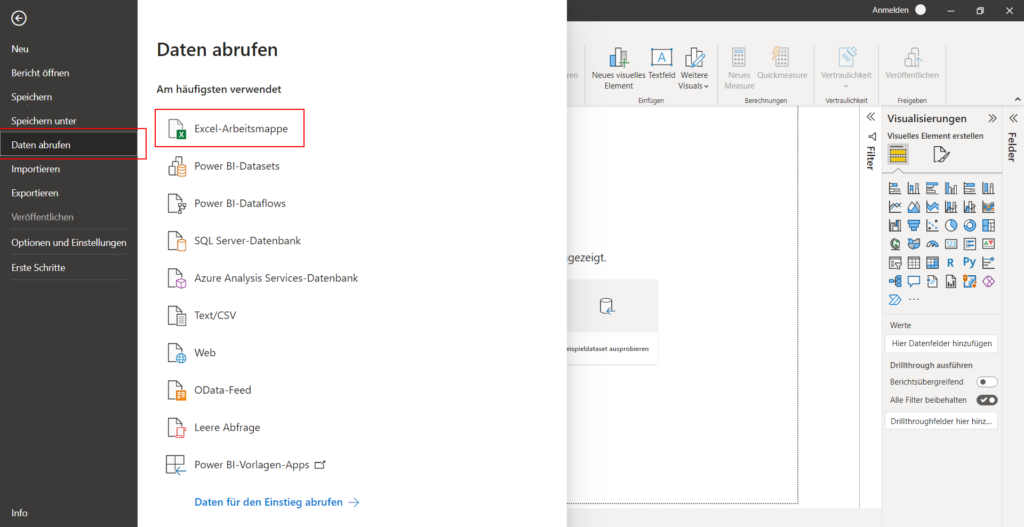
Import an Excel workbook or connect a Google Sheets spreadsheet online to Microsoft Power BI to create a forecast from the data set. The data must be in tabular form: the headers must contain the labels for metrics and dimensions, and the rows must contain the values.
3. Transform data for forecasts in Microsoft Power BI (optional)
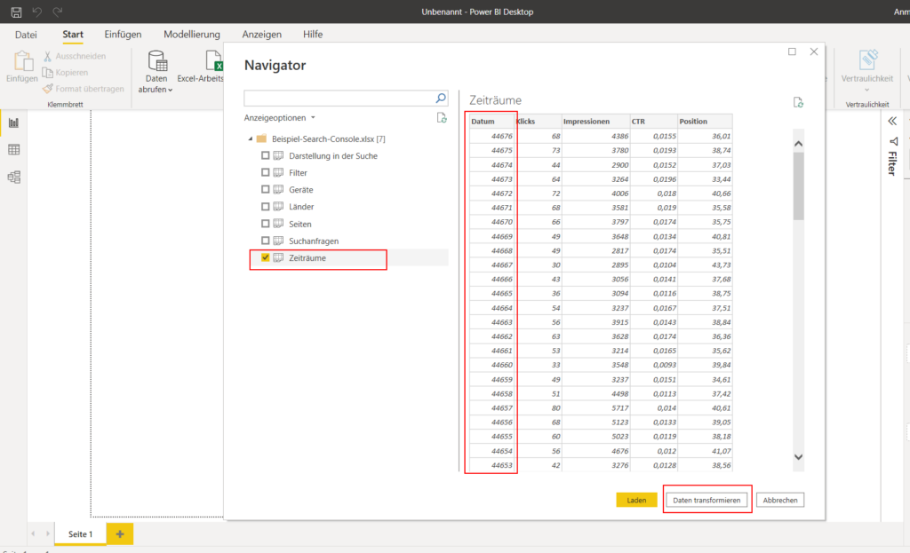
Now it is displayed whether you want to load the data directly or transform it and then load it. If a data format is displayed strangely, it can be formatted appropriately here. Example: Dates from the Search Console are coded unreadably. Select the dataset(s) you want to import and click Transform Data.
If you preview the imported dataset and see that a series of numbers is formatted incorrectly, you can format the data in Microsoft Power BI so that your forecast can also process the correct data.
- Click on the column whose data type you want to transform
- Then click on “Transform” in the top menu
- Then click on “Save as type” and select “Date”.
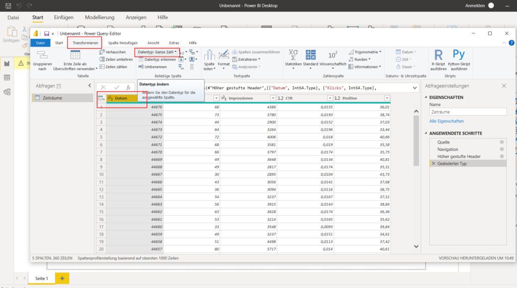
In the Microsoft Power BI data transformation, select the problematic column and enter the correct data type under “Data type” in the toolbar at the top.
When everything is ready, click on “Start” in the top left menu and then on “Close and Apply”
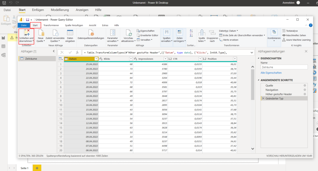
If the column is now formatted correctly, click “Close and apply” in the top left of the Microsoft Power BI data transformation.
4. Create chart for forecasts in Microsoft Power BI
In the right toolbar, select the line chart.
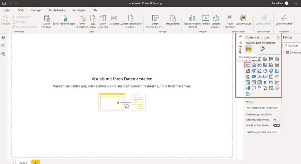
In the Microsoft Power BI toolbar on the right, select a line chart for your forecast.
Expand the imported data set in the “Fields” on the far right. Drag and drop as the first date on your chart. Then drag and drop your desired metric into the chart.
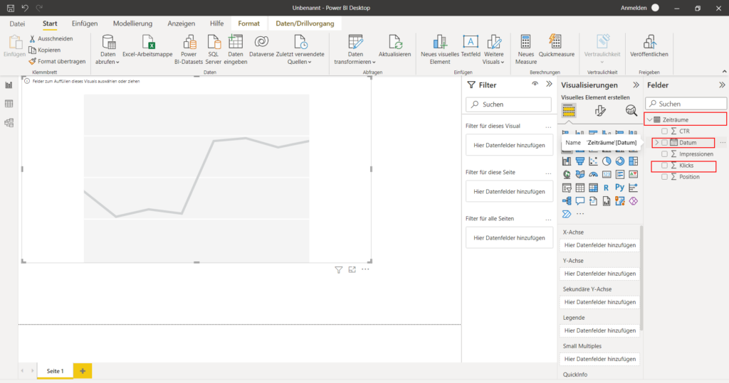
The right menu bar in the Microsoft Power BI dashboard shows you the dimensions and metrics from your data set. Select them to use them in your chart.
Now it may be that the date is displayed inappropriately on the x-axis. In this case: Go to the bottom right “X-Axis” > drop-down area at “Date” and select only “Date” , not “Data Hierarchy”.
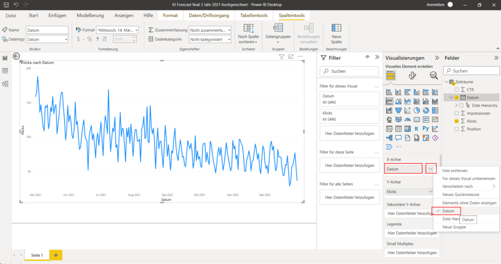
Format the date in Microsoft Power BI for Desktop to display your line chart on a timeline. To do this, select the “Date” option.
5. Create forecast in Microsoft Power BI for Desktop
In the right toolbar panel, click on the “Analysis” icon (it’s a magnifying glass). Below you can already see the forecasting function (“prediction”).
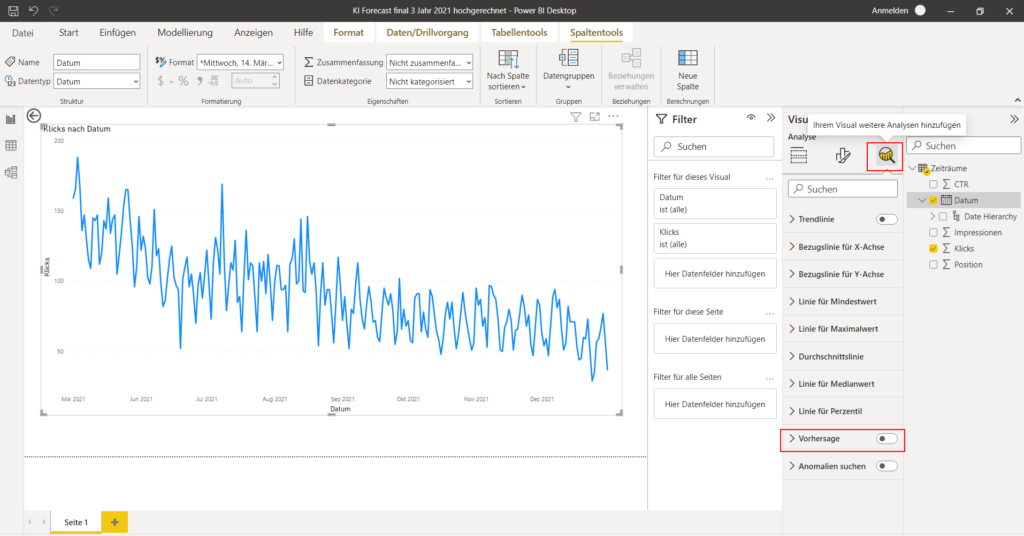
In order for you to see the prediction for a metric in the Microsoft Power BI for Desktop dashboard, it’s important that you only dragged one dimension and one metric into your line chart. If you have dragged two metrics (e.g. impressions and clicks) into your line chart, the forecast function (prediction) is hidden . You can only create a forecast for one metric at a time.
Enable the forecasting (“prediction”) feature in the Microsoft Power BI for Desktop dashboard.
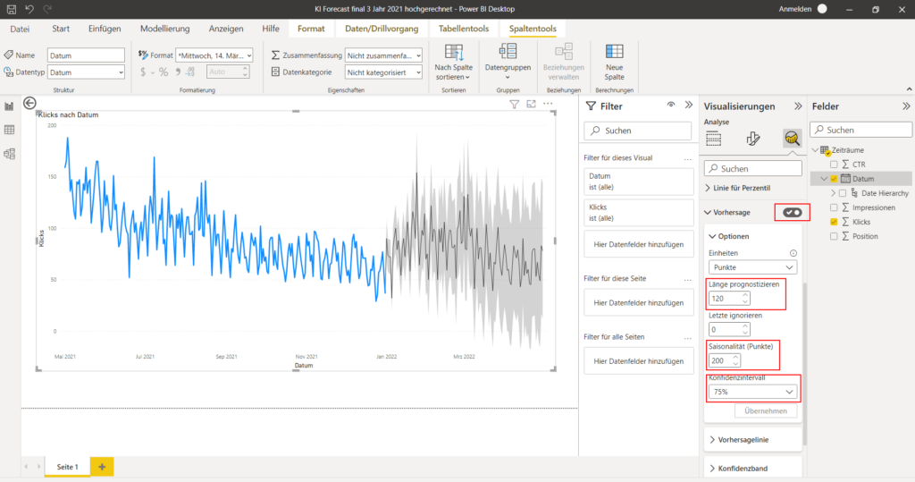
Set the forecast period and the seasonality of your forecast in the right toolbar in Microsoft Power BI for Desktop. The values here are measured by the number of tabular data points you uploaded: If you have 12 months as individual timelines in your dataset, then a counter in forecast period and seasonality means – one month. If you have 365 days of click data and impressions in your spreadsheet, each count in forecast period and seasonality represents one additional day.
6. Set seasonality and forecast period in the forecast in Microsoft Power BI for Desktop
Seasonality: Enter the number of data points that you use in your data set as a temporal dimension so that the entire data set is taken into account. So if the span of your dataset is 30 days, then the number 30 is seasonality. If you have 200 days as a data basis, then enter 200 days accordingly.
Length: How many days should the values be forecast? Enter the number. Recommendation: As a rule, the forecast values should not be higher than the seasonality values. As best practice for organic website clicks from Google search, it is advisable to start with a seasonality of 200 and a forecast period of 120, but this is left to the user and their own creative freedom.
7. Export data
If you want to download the calculated forecast data, you can simply click on the three-point menu in the top right corner of the chart and then click on “Export data”. Then you get the forecast values as Excel. This allows you to carry out your own visualizations with any application.
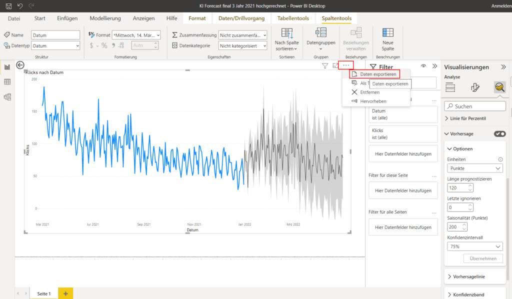
Export your table data with the values on the forecast from Microsoft Power BI for Desktop.
Validation for forecasts with Microsoft Power BI
If you want to validate your seasonality values for forecasts from Microsoft Power BI, you could run a historical forecast to determine the seasonality pattern that caused the trend.

Use case with Microsoft Power BI forecasts: Scenarios
With Microsoft Power BI you can not only create forecasts for metrics from online marketing, but also carry out a scenario simulation – for example in the area of resource planning in content marketing with a forecast for the organic development of clicks from Google search.


Slava Wagner
Marketing & Lead Gen
SEA, paid media, conversion rate optimization, market and trend analysis in the Berlin-Brandenburg area.
Phone: +49 176 588 744 04
Email: info@slavawagner.de
Overview: Forecasts with Microsoft Power BI for Desktop
Microsoft Power BI for Desktop enables you to create forecasts based on regression analyzes for metrics in the field of online marketing, among other things.
Plus, with Microsoft Power BI for Desktop, you can visualize, explore, and analyze your forecasts to make more informed decisions and improve overall reach and resource planning development. With forecasts from Microsoft Power BI for Desktop, you can extrapolate your inventory data with seasonality values using a regression analysis, and react to upcoming developments before they occur.
With regression analysis and the underlying seasonality values, Microsoft Power BI for Desktop automatically recognizes patterns and trends in the data. Users can test different scenarios and seasonalities to get different results and view the data from different perspectives. Overall, the forecasts from Microsoft Power BI for Desktop offer a powerful and at the same time easy-to-maintain option for creating forecasts from inventory data without resorting to your own machine learning models, which also work with regression analysis.
FAQ - Summary of forecasts with Microsoft Power BI for Desktop
Here you will find a summary of important and frequently asked questions about forecasts with Microsoft Power BI for Desktop:
With Microsoft Power BI for Desktop you can basically forecast all kinds of data over time that contain a time axis as a dimension. The data can be in tabular form, for example as an Excel file or Google Sheets table, which can be connected online. The table headers should contain the labels for the dimensions and metrics, while the rows contain the values.
With Microsoft Power BI for Desktop you can create a forecast by dragging a dimension and a metric from your data set into a line chart and turning on the forecast function in the right toolbar. However, this only works if you use a dimension and a metric for your line chart. From two metrics, the prediction function is automatically hidden.
Seasonality in a forecast in Microsoft Power BI for Desktop indicates which development pattern to use for regression analysis in the forecast. A counter in seasonality corresponds to a data point in your data set. If you have 200 days of data in the rows in your Excel spreadsheet, and you enter a seasonality of 200, that would correspond to all 200 days. If you have 24 months of data in 24 rows in a tabular dataset, and you use your seasonality of 3, the last 3 months of your dataset would be used as the seasonality for the regression analysis.
The forecast period in a forecast in Microsoft Power BI for Desktop indicates how many data points your forecast should go into the future. A counter in the forecast period corresponds to a row in your Excel spreadsheet in the timeline. So if you have 365 rows in your spreadsheet and enter a forecast period of 90, the forecast would be 90 days into the future.